During the brand development process, Renault has changed its logo 8 times to fit specific circumstances of the automotive industry and the world. The 8 logo changes marked the most difficult, bitter and glorious moments of the French carmaker.
1. “Brotherhood of Renault”
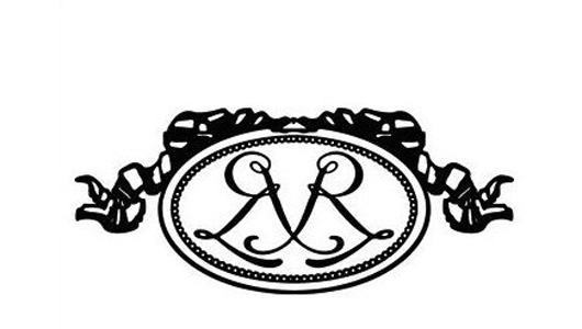 Renault logo from 1900 to 1906
In 1898, on his 21st birthday, Louis Renault chose that special occasion to sell a very classic car that he himself invented, called Renault Type A. In 1899, Louis and his two brothers Marcel and Ferand opened the company “Renault Frères – The Renault Brothers”, at 10, Cours Avenue, Billancourt. As the name implies, Renault designed the company’s first logo with two “R” letters intertwined, in the artistic style of the early 20th century.
2. “Car enclosed in mechanical bearings”
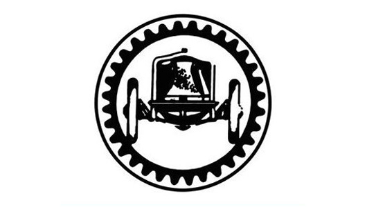
Ten years later, Renault Frères achieved continuous success: in 1902, it was granted a patent for the supercharged engine; in 1906, it produced buses and started manufacturing airplane engines with a capacity of 3,800 units per year. In the same year, Renault changed its logo, but with a much simpler and realistic image: a car enclosed in mechanical bearings.
3. Image of a tank climbing up a hill
However, during that time, Louis had to witness the deaths of Marcel in 1903 at the Paris-Madrid race and Ferand in 1909. Louis became the sole owner of Renault Frères, but soon after, out of love and memory for his two brothers, he changed the company’s name to Les Automobiles Renault – the Renault Automobile Company.
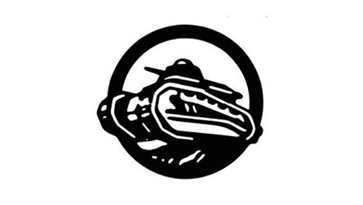
World War II broke out, at the request of the Allies, Renault stopped producing cars and focused on tanks and airplanes. Accordingly, the company’s logo was also changed to suit the wartime situation. The car was replaced by an image of a tank climbing up a hill.
4. Renault and the radiator grille logo
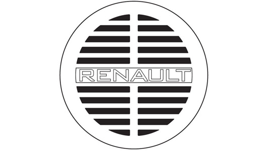
After the war, Louis Renault received the hero’s medal and continued to produce cars with models like 10CV or 6CV. In 1923, leaving behind the fierceness of the war to return to the main role, Renault changed its logo for the third time with a main circular frame surrounding horizontal stripes simulating the radiator grille and the word “Renault”.
5. From a circle to a rhombus
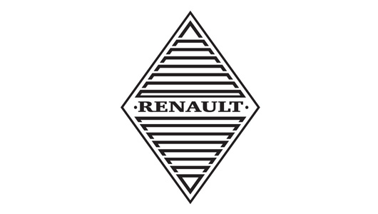
Two years later, Renault replaced the circle with a rhombus and made it the official logo of the company. However, before 1925, the rhombus logo had existed on most car models for a completely random reason; originating from the design style of the bonnet. At that time, the bonnet on Renault cars extended down to the front bumper with a prominent ridge in the middle, creating a combination of two planes.
But that design had an obstacle because the horn was right below. Therefore, to let the sound of the horn out, engineers carved openings parallel to each other on the bonnet, forming a rhombohedral shape. With the word “Renault” running horizontally, unintentionally, this rhombus shape was considered the official logo.
6. Logo of rebirth
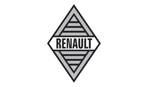
After suffering heavy losses from the economic crisis of the 1930s and World War II, Renault revived in 1960, and to mark this new development period, the company decided to change its logo for the fifth time. The new logo had some changes compared to 1925. The word “Renault” was made bold and tall, standing out on a white hexagonal frame. The crossbars were thinner and bolder. Renault used this logo until 1972, before changing it for the sixth time.
7. Virtual rhombus logo
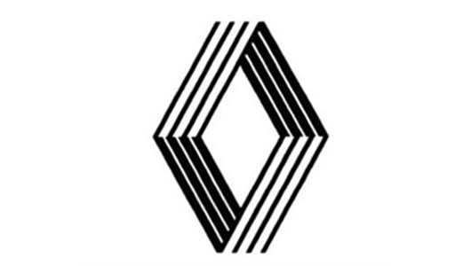
The 7th Renault logo gave up the familiar “text-image” design. Only the rhombus remained, but it consisted of multiple intersecting lines on a 3D coordinate axis, creating a somewhat “ambiguous” effect for viewers. However, on documents, Renault still used a logo with the word “Renault” alongside.
8. Simplification
In 1992, the 8th logo was born. No more lines, instead, a uniform two-color black and white surface, symmetrical to each other through a vertical axis.
Still as prominent as 20 years before, but less complex and “eye-catching”, the 1992 logo was friendly, glossy and had a higher sense of technology. It was used by Renault on the radiator grille of its car models since 1992, but on documents, the company still used a logo with the word “Renault” below.
9. Current Renault logo
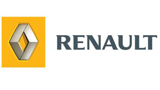
In 2004, Renault introduced the 9th logo and kept the basic structure. Prominent thanks to its glossy surface and folded lines on the body, the 9th logo represents the continuous technology and creativity throughout the formation and development process of the company. It is simple and highly unified. Then, in 2007, Renault changed it once again and has been using it until today.
Thu Ha (Based on TTTD/ Source: Compilation)
8 Instances of Renault Logo Transformation
Renault has gone through 8 logo transformations during its brand development journey, each one reflecting the evolving landscape of the automotive industry and the world. These 8 logo changes symbolize the toughest challenges, the struggles, and the triumphs that Renault, the French car manufacturer, has encountered along the way.


