Throughout the process of developing the brand, Renault has changed its logo 8 times to adapt to the specific circumstances of the automotive industry and the world. These 8 logo changes marked significant moments for the French carmaker, encompassing both challenges and achievements.
1. “Brotherhood of Renault”
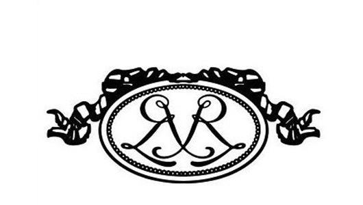
In 1898, on his 21st birthday, Louis Renault took the opportunity to sell a classic car of his own invention called Renault Type A. Subsequently, in 1899, Louis and his two brothers, Marcel and Ferand, established the company “Renault Frères – The Renault Brothers” at 10, Cours Avenue, Billancourt. Reflecting their sibling collaboration, the company’s first logo featured two intertwined “R” letters, showcasing the artistic style of the early 20th century.
2. “Car enclosed in mechanical bearings”
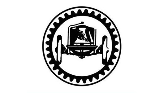
Over the next 10 years, Renault Frères experienced significant success. In 1902, the company was granted a patent for its supercharged engine, and by 1906, it had begun producing buses and manufacturing airplane engines at a rate of 3,800 units per year. During this time, Renault simplified its logo, opting for a more realistic image of a car enclosed in mechanical bearings.
3. Image of a tank climbing up a hill
However, tragedy struck during this era as Louis witnessed the deaths of his brothers. Marcel passed away in 1903 during the Paris-Madrid race, and Ferand died in 1909. Despite these losses, Louis carried on as the sole owner of Renault Frères. In memory of his brothers, he renamed the company Les Automobiles Renault – the Renault Automobile Company.
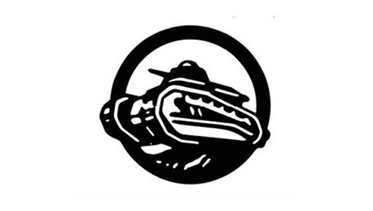
With the outbreak of World War II, Renault played its part as requested by the Allies. Production of cars ceased, and the company shifted its focus to manufacturing tanks and airplanes. Consequently, the logo was changed to reflect this wartime context, replacing the car with an image of a tank climbing up a hill.
4. Renault and the radiator grille logo
After the war, Louis Renault was awarded a hero’s medal and continued to produce cars, including models like the 10CV and 6CV. In 1923, marking their return to the forefront, Renault altered its logo for the third time. The new logo featured a circular frame surrounding horizontal stripes, mimicking a car’s radiator grille, accompanied by the word “Renault.”
5. From a circle to a rhombus
Two years later, Renault replaced the circle in its logo with a rhombus, which became the official logo of the company. However, before 1925, the rhombus logo had been used on Renault cars for a different reason. It originated from the design style of the bonnet, where the bonnet extended down to the front bumper and featured a prominent ridge in the middle, creating a combination of two planes.
Due to the horn’s placement right below this design, engineers carved parallel openings on the bonnet to let the sound escape, forming a rhombus shape. With the word “Renault” placed horizontally within this shape, it unintentionally became the official logo.
6. Logo of rebirth
Following significant losses during the 1930s economic crisis and World War II, Renault experienced a revival in 1960. To symbolize this new era of development, the company decided to change its logo for the fifth time. The new logo featured some modifications compared to that of 1925. The word “Renault” was bold and tall, standing out against a white hexagonal frame. The crossbars were thin yet striking. This logo remained in use until 1972, when Renault introduced its sixth logo.
7. Virtual rhombus logo
The seventh Renault logo abandoned the traditional “text-image” design. Only the rhombus remained, but it was composed of multiple intersecting lines in a 3D coordinate axis, creating a somewhat “ambiguous” effect for viewers. Nevertheless, Renault continued to use a logo that featured the word “Renault” alongside the rhombus in official documents.
8. Simplification
In 1992, Renault introduced its eighth logo. This logo abandoned the use of lines, instead featuring a unified two-color surface in black and white, symmetrical to each other along a vertical axis.
While the 1992 logo continued to be prominent, it was less complex and eye-catching compared to its predecessor. The logo had a friendly, glossy appearance and conveyed a sense of advanced technology. It adorned the radiator grilles of Renault car models starting from 1992, while official documents continued to feature a logo with the word “Renault” below.
9. Current Renault logo
In 2004, Renault unveiled its current logo, which maintained the basic structure while featuring a glossy surface and fold lines on the body. This ninth logo embodies the continuous technological advancement and creativity that shaped the company’s formation and development. It is characterized by simplicity and unity. In 2007, Renault made slight changes to this logo, which has been in use ever since.
Thu Ha (Based on TTTD/ Source: Compilation)


