Ford Motor: A Journey of Logo Evolution
The Ford Motor Company has a rich history spanning over 110 years. Over this time, the company has undergone several logo changes. Let’s delve into the fascinating evolution of this automotive icon.
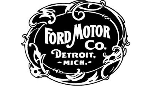
1903 – The Birth of Ford Motor Company and its Iconic Border
In 1903, Ford Motor Company made its debut in the commercial world. During the mass production of the Model A cars, Henry Ford’s assistant made a significant improvement by enclosing the company name within a unique and trendy border, transforming it into an iconic symbol of the time.
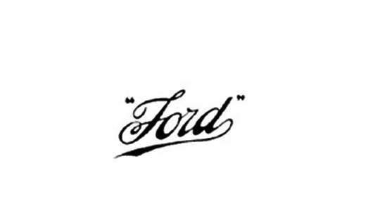
1909 – The Introduction of the Angled Ford Name Logo
Realizing the need for a simpler, visually appealing, and future-oriented logo, Henry Ford brought about a significant change in 1909. The Ford name was written at a 45-degree angle, stylized with soft and glamorous letters ‘F’ and ‘D,’ symbolizing refinement and the relentless pursuit of progress. This new logo was officially introduced and copyrighted at the US Patent Office.
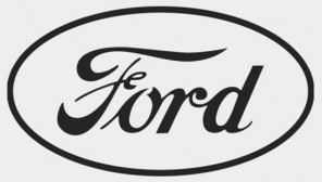
In addition to the US logo, an oval-shaped Ford icon was first unveiled in the UK in 1907. Designed by Perry, Thornton, and Schreiber – the dealers responsible for bringing Ford to the UK – the logo aimed at promoting Ford’s products as a “symbol of trust and savings”.
In 1911, Ford introduced the oval-shaped logo to unify its dealers in the UK. However, the initial logo continued to be used on products and in commercial transactions until the 1920s.
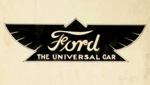
1912 – Transition from Wings to Oval Shape
In 1912, Ford swiftly replaced all oval-shaped logos with a logo featuring a winged triangle on its products. This insignia embodied speed, elegance, grace, and stability. Featuring a combination of yellow and black, with the words “Universal Car” imprinted, this logo was Henry Ford’s temporary vision and soon vanished from the company’s products.
1927 – Embracing the Blue Oval
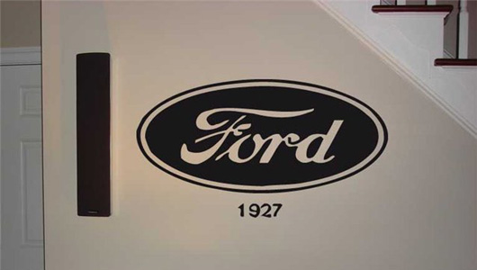
In 1927, the Ford oval-shaped logo made its first appearance on the radiator grille of the new Model A. This logo featured a deep royal blue background, reminiscent of the current Ford logo. It remained a prominent feature of most car models until the late 1950s. The logo maintained its consistent presence in all commercial transactions until it underwent a redesign in the mid-1970s.
1976 – The Modern Ford Icon
In 1976, the iconic blue and silver oval-shaped Ford logo became the certified brand symbol of the Ford Motor Company. It quickly gained popularity and became synonymous with the company’s worldwide presence.
The new logo featured two concentric ellipses with a long axis to width ratio of 2.55, perfectly matching the size ratio of the Ford letters, set at 2.4. The logo was embossed to exude strength and prosperity. The outer oval had a polished silver metallic finish, symbolizing Ford’s advanced technology. And of course, the enduring blue color, representing friendliness, durability, and Ford Motor Company’s unwavering commitment to its customers.
Thao Anh (Source: TTTÐ/ Compiled)


