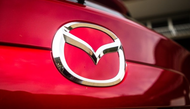
There are speculations that Mazda is preparing to change its logo after a long period of use.
According to recent reports, the Japanese automaker has filed for a trademark on a new logo.
The new logo is a black and white version that is designed to be simpler and sharper than the familiar “V-shaped wings” logo currently in use. The logo has also been transformed from 3D to 2D, and the “V” shape has been redesigned to be less fluid than its predecessor.
The “V-shaped wings” logo was first introduced by Mazda in 1997 and has since undergone three updates. The stylized “V” resembles outstretched bird wings, symbolizing agility, speed, stability, and strength.
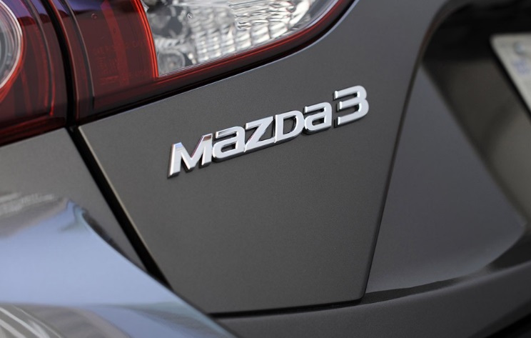
In addition to the logo, Mazda has also trademarked a new font. The company name is now written in all capitals using this new font, similar to the font used for subsidiaries such as Mazda Foundation and Mazda Driving Academy, as well as on popular models like the Mazda 3.
From 1975 until recently, Mazda used a distinctive logo with a special emphasis on the letters “m” and “a” in lowercase, while “d” and “z” were capitalized. The “z” in particular, designed in a metal-cut style, was quite striking.
Mazda has not yet officially confirmed these changes. It is unclear if the new logo and font will be adopted across the entire company or limited to specific divisions, such as replacement parts.
TH (Tuoitrethudo)


