Up to now, Ford Motor has a 110-year history of formation and development. However, the company’s current logo is only over 40 years old. Before that, Ford has changed its logo many times. Let’s explore the history of this car manufacturer’s icon.
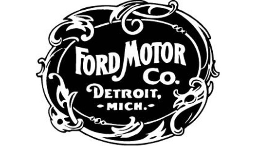
1903 – Ford Motor Company and the Unique Border
In 1903, the brand “Ford Motor Company” was used in the first commercial transactions, but when starting mass production of Model A cars, Henry Ford’s assistant made special improvements to turn the company name into an icon by surrounding it with a unique and trendy border at that time.
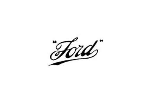
1909 – Logo with the Ford Name Written at a 45-Degree Angle
After the initial development, Henry Ford realized the need for changes in logo design to make it simple, visually appealing, and impressive. Also, the logo had to reflect the remarkable progress of Ford Motor in the future. In 1909, a logo with the Ford name written at a 45-degree angle was stylized in the letters F and D to be soft, glamorous, demonstrating refinement and the desire for further advancement by Henry Ford. It was officially introduced and copyrighted at the US Patent Office.
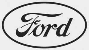
Alongside the logo registered in the US, the oval-shaped Ford icon was first introduced in the UK in 1907 by Perry, Thornton, and Schreiber – the dealers who brought Ford into the country – designed to advertise Ford’s products as a “symbol of trust and savings”.
In 1911, Ford introduced the oval-shaped logo and used it to unify dealers in the UK. However, on products and in commercial transactions, Ford still used the initial logo until the 1920s.
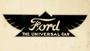
1912 – From Wings to Oval Shape
In 1912, within a short period, Ford removed all oval-shaped logos and replaced them with a triangle-shaped bird wing logo on its products. This logo was designed to represent speed, elegance, grace, and stability. It had two colors, yellow and black, with the phrase “Universal Car” written on it. Henry Ford did not like this icon, and for a short time, it disappeared from Ford’s products.
1927 – Ford in a Blue Oval
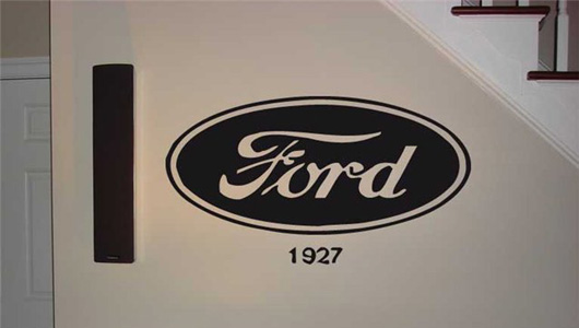
In 1927, a Ford oval-shaped logo appeared on the radiator grille of the new Model A with a deep royal blue background similar to Ford’s current logo. It was used in most car models until the late 1950s. It was consistently used in all commercial transactions until the idea of this oval-shaped logo was redesigned in the mid-1970s.
1976 – Ford’s Icon to Date
In 1976, the oval-shaped Ford logo with two colors, blue and silver, was used as a sign to certify the brand of Ford Motor Company. It easily became popular and adaptable to all of Ford’s manufacturing plants worldwide.
The new logo consisted of two concentric ellipses with a long axis to width ratio of 2.55, compatible with the size of the Ford letters with a ratio of 2.4. The entire logo was embossed to symbolize strength and prosperity. The outer oval was also polished with a silver metallic finish, symbolizing the outstanding technology of Ford-branded products. And of course, we cannot overlook the blue color that has persisted for 100 years, representing friendliness, endurance, and Ford Motor Company’s constant care for consumers.
Thao Anh (Source: TTTĐ/ Compiled)
Lexus – “Striving for Perfection”
Ever since it emerged from the Toyota family, Lexus has embraced the slogan “Pursuing Perfection”. With a steadfast commitment to excellence, the team behind this esteemed luxury car brand has dedicated over two decades to crafting opulent and sophisticated products that embody the essence of its name.
Changing Ford Motor’s Icon: The Process
Ford Motor has a long and fascinating history spanning over 110 years. However, its current logo is relatively young at just over 40 years old. Before its current design, Ford went through several logo transformations. Join us on a journey through the evolution of this iconic symbol for one of the world’s leading automotive brands.


